 Panel & Notifier for IW
Overview
Panel & Notifier for IW is a Chrome extension developed by Lynn.
According to the data from Chrome web store, current version of Panel & Notifier for IW is 0.1.5, updated on 2020-07-05.
197 users have installed this extension.
2 users have rated this extension with an average rating of .
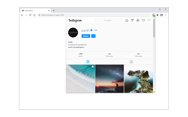
check your Instagram while you browse, plus, get badge notifications for new posts.
Panel & Notifier for IW is an easy way to browse your Instagram wall from a toolbar popup, plus, get badge notifications for new posts.
Some features:
1. A complete Instagram page right in your browser toolbar.
2. Notifies you every time a new item(s) is posted to your wall.
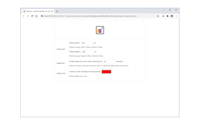
3. The badge-icon text shows you the number of recent items.
4. You can adjust the badge number based on the new post's time-frame (see options page for more details).
5. Popup width and height are adjustable to your choice (in options page).
Note: Panel & Notifier for IW does NOT belong or relate to the official Instagram application at all. It is an unofficial extension that is developed and maintained independently.
To report Bugs, please visit the add-on's homepage (https://mybrowseraddon.com/instagram-panel.html) and fill the bug report form.
Panel & Notifier for IW Alternatives


Latest Reviews
See More|
2017-10-10
This cute concept of a simple dropdown iframe seems to pass over every developer's mind on here, and I'm glad to finally have discovered this. |
|
2017-10-10
This cute concept of a simple dropdown iframe seems to pass over every developer's mind on here, and I'm glad to finally have discovered this. |
|
2017-10-10
This cute concept of a simple dropdown iframe seems to pass over every developer's mind on here, and I'm glad to finally have discovered this. |
|
2017-10-10
This cute concept of a simple dropdown iframe seems to pass over every developer's mind on here, and I'm glad to finally have discovered this. |
|
2017-10-10
This cute concept of a simple dropdown iframe seems to pass over every developer's mind on here, and I'm glad to finally have discovered this. |